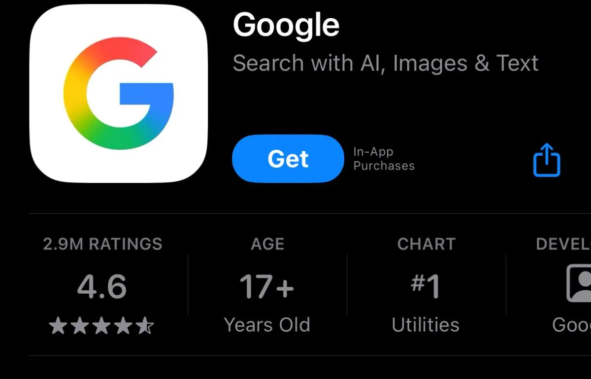
In recent days, observant Google users have noticed a subtle but significant change in the company's branding. In certain instances, the iconic capital G logo now features a gradient that softens the transitions between its four solid-color sections. This update has been implemented for the Google app on both Android and iOS devices, marking a shift in the visual identity of one of the world's most recognized brands.
Despite this new gradient design, it's important to note that several instances still showcase the classic color block look. For example, browser favicons continue to display the traditional style, and the classic version remains the default for Google's official press images. Currently, the other Google smartphone applications have not adopted this new gradient aesthetic, maintaining the familiar branding that users have come to know.
Interestingly, the branding for Google's Gemini AI assistant does incorporate a slight gradient on its star symbol, suggesting that the trend toward gradient designs may be emerging within the company. This raises questions about whether artificial intelligence is influencing aesthetic choices at Google or if this is part of a broader strategy to modernize their branding.
The lack of fanfare surrounding this change is particularly intriguing. Historically, when Google last underwent a branding refresh in 2015, it was accompanied by a comprehensive campaign detailing every aspect of the redesign. Given Google's prominence, even minor branding adjustments typically undergo extensive review and approval processes. Therefore, the piecemeal approach to implementing this new gradient design raises eyebrows among branding experts.
For a corporation as large as Google, maintaining brand consistency is crucial. Any shift in branding strategy is usually executed with precision to prevent confusion among users. Thus, if this gradient logo is indeed a permanent change, the gradual rollout is somewhat perplexing. The branding community is left to wonder if this is a deliberate strategy to gauge user reactions before committing to a full-scale redesign.
As we look to the future, it remains to be seen whether gradients will become the dominant design trend for all Google products by 2025. We have reached out to the company for further insights regarding this potential shift in branding strategy and whether users should anticipate more changes in the coming months.