At the recent WWDC event, Apple introduced its groundbreaking Liquid Glass design language, which is set to enhance all of its devices, including the latest Macs. As an early adopter, I’ve spent a day exploring the beta version of macOS Tahoe 26 on the M4 MacBook Air. While some of the aesthetic updates are impressive, others feel overdone. However, the new features in Spotlight search are particularly noteworthy and add significant usability enhancements.
The most visible changes in macOS Tahoe 26 include subtle glass-like transparency effects integrated across various elements such as the Dock, Finder, widgets, and built-in applications. Compared to the iPhone, these elements appear more refined on the Mac, primarily due to the larger screen real estate that allows for a more accentuated design rather than overwhelming the user interface.
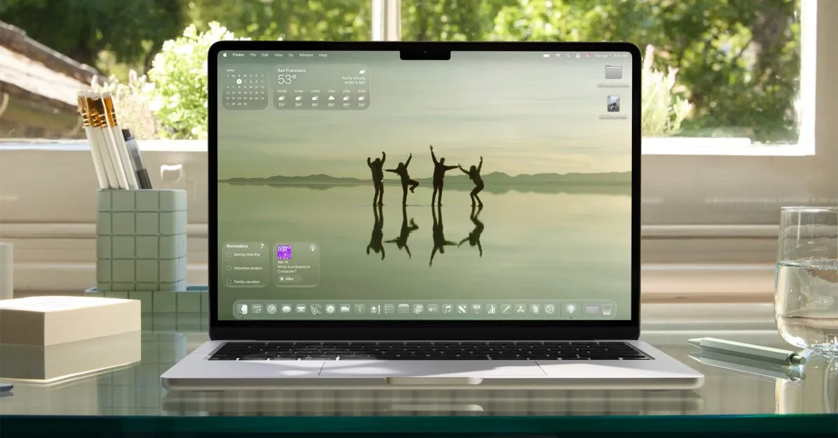
One of the most noticeable modifications is the Dock, which now features a frosted background that enhances its translucency compared to the flatter design of Sequoia. The hazy, frozen glass aesthetic extends to widgets like the calendar and weather, as well as drop-down menus, although the latter maintain a higher opacity for clarity. However, the pop-ups for volume and brightness adopt this distorted glass appearance, moving to the top-right corner of the screen, which may feel out of place for some users.
Another significant update is the invisible Menu Bar at the top of the screen, which no longer obscures the notch cutout with a dark gray bar. Initially, this change was somewhat disconcerting, but it quickly became a non-issue, much like the adjustment users had to make with the first notched MacBook. For those who dislike this aesthetic, the “Reduce transparency” option in the accessibility menu allows users to revert to a filled-in Menu Bar, restoring the original look while disabling most of Tahoe’s transparency effects.
One delightful feature that the invisible Menu Bar enables is a new animation during Mission Control activation. When users perform a three-finger swipe up, a glass pane descends from the top, distorting the view of the wallpaper beneath, adding a touch of flair to the experience.
Another exciting change is the integration of widgets directly on the desktop, eliminating the need to swipe over to the Notification Center. This allows users to customize their desktop with glanceable information similar to an iPad home screen. In Finder windows, the design follows the rounded aesthetic of Tahoe, with the sidebar resembling a tall, oval-shaped nested window. Differences between light mode and dark mode are apparent; the light mode flattens Finder windows, while the dark mode maintains a more glassy appearance.
One of the most significant improvements in macOS Tahoe 26 is the revamped Spotlight search. The update makes it easier for users to operate their Mac solely via keyboard shortcuts. When users call up Spotlight by pressing Command and Space, hovering over the search bar reveals four new icons for quick access to functions such as Apps, Files, Shortcuts, and Clipboard history, each equipped with handy keyboard shortcuts.
For instance, users can press Command along with numbers 1 through 4 to quickly access different categories. The Apps drawer acts as a categorized launcher, while the Files section lists recent and suggested documents at the top. The Shortcuts feature allows users to type commands for compatible apps, and the Clipboard function displays a reverse chronological history of recently copied items. I appreciate the ability to set custom quick key commands, which enhances workflow efficiency.
Several users have noted that Apple’s updates to Spotlight appear to be a response to Raycast, a highly customizable and powerful alternative to Spotlight that offers features like math calculations, unit conversions, and third-party extensions. While the enhancements in macOS Tahoe enable Spotlight to encroach on some of Raycast’s territory, it still lacks the extensive functionality of its competitor—at least for now. Apple will need to invest more time and development to fully cater to power users of productivity tools.
Having spent a day with the first developer beta of macOS Tahoe, there is much more to discover as developers continue exploring its capabilities. The public beta is expected to launch next month, and there’s a strong possibility that Apple will implement significant changes and UI tweaks before then, refining the user experience further.