Apple’s latest update, iOS 26, has introduced a stunning system-wide redesign featuring transparent elements known as Liquid Glass. This significant update not only transforms the aesthetic of the operating system but also includes all-new app icons for Apple’s built-in applications. One of the most groundbreaking features of this update is the ability to customize every app icon on your iPhone, allowing for a clear and modern look on the Home Screen.
To implement the Clear icon appearance on your iPhone, follow these simple steps:
Touch and hold an empty area on your Home Screen until the icons begin to jiggle. Tap Edit in the top left corner. Select Customize, the second option in the menu that appears. From the Customize menu at the bottom of the screen, tap Clear, which is the third icon type. By default, the Light appearance will be selected. You can also opt for Dark or Auto, which adjusts based on whether light or dark mode is active on your device. Finally, tap anywhere on your Home Screen to save your changes.If you decide you want to revert to the full-color icons, simply repeat steps 1-3 but select Default instead of Clear.
iOS 26 expands your options further by allowing you to choose between always using Dark icons, switching automatically between Default icons and Dark icons based on your device's light settings, and a redesigned Tinted option. The Tinted mode now includes a new Light option, a revamped Dark option, and the Auto option for seamless transitions based on the system appearance.
The exciting app icon customization features are not limited to the iPhone. iPadOS 26 offers the same capabilities for iPad users, allowing them to set their app icons to Clear. Additionally, macOS Tahoe 26 brings dark icons alongside the clear and tinted options for the first time on Mac devices. To set your iPad app icons to Clear, simply follow the same steps as above.
For Mac users, the Clear mode can be found by navigating to Settings > Appearance > Icon & widget style.
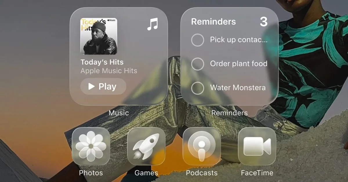
On both the iPhone and iPad, you can create multiple Home Screens by long-pressing on your Lock Screen, allowing further customization of app icon appearances for each screen. The Clear icon mode will also extend its visual effects to your Home Screen widgets, providing a cohesive and modern aesthetic.
While the Clear icons may make identifying apps by their icons more challenging, the light Clear option represents the most significant change to the Home Screen since the introduction of widgets. This futuristic look is particularly striking on the iPad, enhancing the overall user experience.
What’s your preference when it comes to app icon appearance? Could you see yourself using Clear icons full-time? Do you think Apple should extend this feature to the Apple Watch and Apple TV? We invite you to share your thoughts and experiences in the comments below!