Google is set to enhance the user experience with a vibrant redesign of the Settings app. The tech giant is preparing to introduce more colorful icons on the Settings homepage, marking a shift towards a more expressive design. This update is part of Google’s broader initiative to refresh its interface, making it not only functional but also visually appealing.
While it remains uncertain if these colorful icons align with Google’s upcoming Material Design 3 Expressive theme, recent findings suggest a significant update is on the horizon. Earlier this week, evidence emerged indicating that Google plans to unveil this new expressive theme during the much-anticipated Google I/O developer conference next month. Although several references and examples of the new design have surfaced, the exact details of this revamped framework are still under wraps.
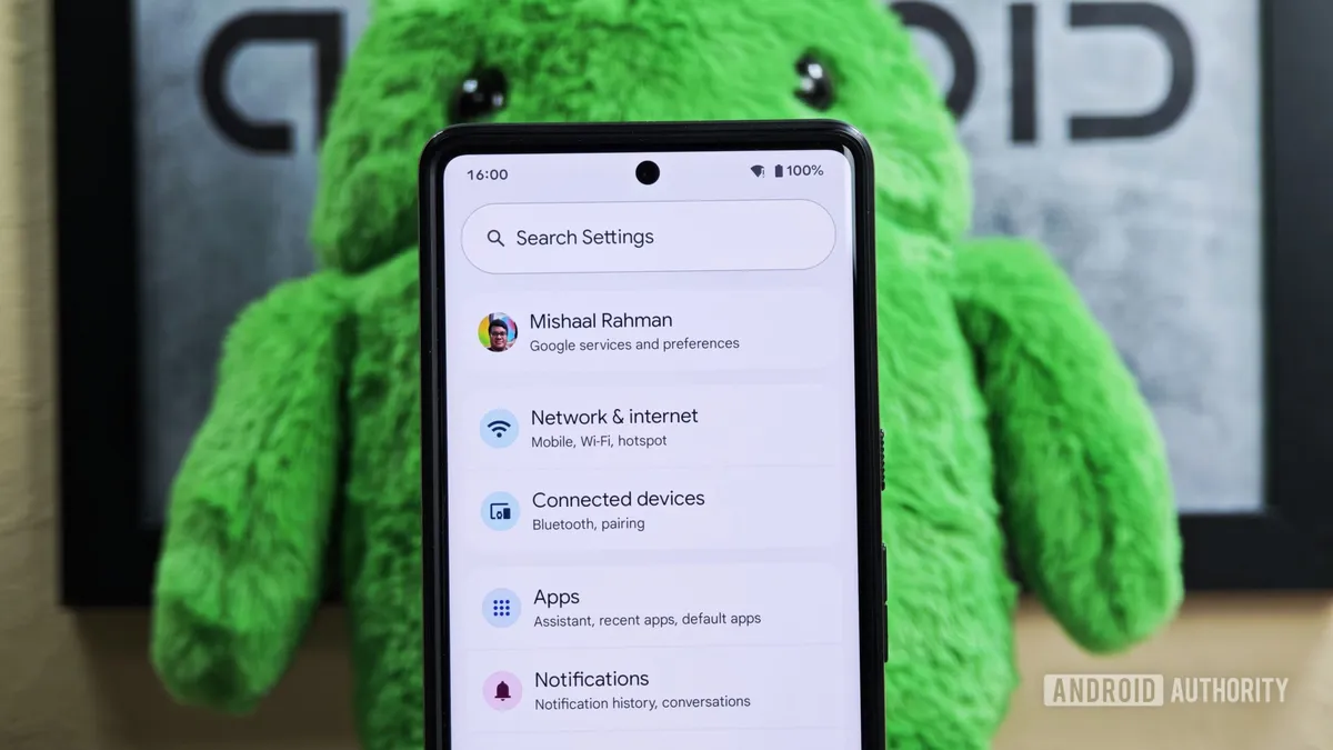
The latest beta version of Android 16 has revealed new insights into the expressive redesign Google is developing for the Settings app. Although the fourth beta of Android 16 does not introduce major user interface (UI) changes, it does include notable updates to the Settings homepage. Each entry in the Settings app is expected to feature colorful new icons, replacing the current simple gray, borderless icons that are visible to the left of the text.
In the expressive redesign, these icons will be enclosed within circles of various colors, adding a fresh and engaging visual element to the homepage. The contrast between the previous grayscale look and the upcoming colorful icons is striking, as illustrated in the comparisons between the latest Android 15 release and the redesigned Settings homepage in Android 16 Beta 4.
Interestingly, the ‘Digital Wellbeing & parental controls’ entry retains its gray icon because it is provided by the separate Digital Wellbeing app rather than the Settings app itself. This inconsistency highlights that Google still has some work to do before the full rollout of the expressive redesign. As such, it seems unlikely that we will see this new design, including the colorful icons, in the initial stable release of Android 16.
Instead, users may have to wait for a future quarterly release of Android 16 or potentially until Android 17 arrives next year for the updated Settings look. It’s also possible that the colors and iconography may undergo further changes before the official launch of this new design.
What do you think about these colorful new icons in the Settings app? Are you excited about the upcoming changes, or do you prefer the classic grayscale aesthetic? We invite you to share your thoughts in the comments below! If you have any tips or insights, feel free to reach out to our team at news@androidauthority.com. You can choose to remain anonymous or receive credit for your information—it's entirely up to you!