The latest update from Apple, iOS 26 Developer Beta 3, has made significant adjustments to the new glassy interface, which was initially introduced at WWDC 2025. This update comes in response to user feedback highlighting that the previous version of the interface made certain elements difficult to read, causing frustration among users. The focus on enhancing the visual experience while maintaining usability is a top priority for the tech giant.
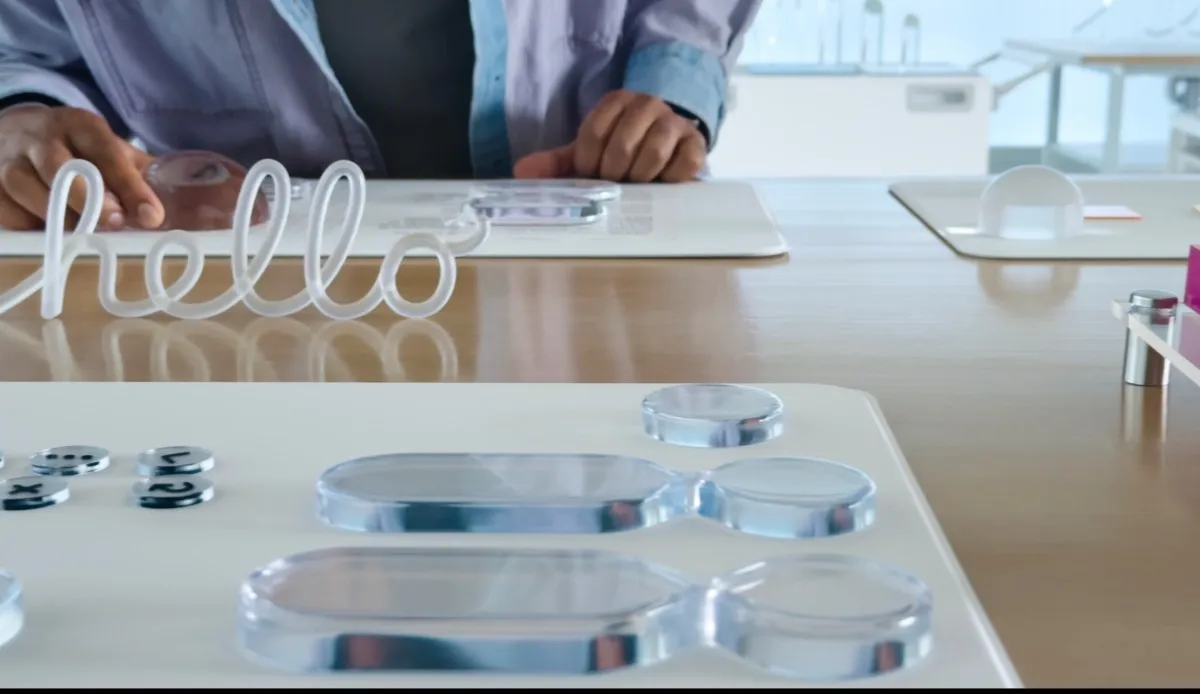
Introduced at the Worldwide Developers Conference (WWDC) 2025, Apple's new design language, dubbed Liquid Glass, draws inspiration from the natural optical qualities of glass. This innovative design aims to replicate how glass refracts light and its inherently translucent properties. However, the initial rollout of this design in the first developer beta of iOS 26 revealed that while visually appealing, it left significant room for improvement regarding usability, accessibility, and legibility.
Following user complaints regarding the overly transparent aspects of the Liquid Glass design, Apple took steps to address these concerns. Last month, the company made several adjustments, notably in the Control Center, where transparency levels were dialed back to eliminate visual clutter caused by icons and widgets shining through. The recent update, Developer Beta 3, continues this trend, focusing on enhancing key areas such as Notifications and navigation within first-party applications like Apple Music.
This update has brought several notable changes that enhance the user experience. For example, the navigation bar in the Apple Music app now features a solid white background instead of the previous translucent design. Additionally, the Notifications section has also seen improvements, with the background behind the text darkened to increase contrast, making it easier for users to read notifications at a glance. These modifications aim to strike a balance between aesthetic appeal and practical usability.
While many users appreciate the adjustments made in Developer Beta 3, some have expressed concerns that Apple may have swung too far back toward a more “frosted glass” aesthetic. It’s essential to keep in mind that these changes are part of the beta testing phase, where Apple gathers valuable feedback from developers and users alike. This ongoing feedback loop allows the company to identify bugs, refine features, and optimize the overall functionality of the Liquid Glass design.
As we approach the public release of iOS 26 this fall, it is clear that Apple is committed to refining its new glassy look. Throughout the beta testing process, users can expect further tweaks and adjustments to ensure that the final version strikes the right balance between an eye-catching design and practical usability. With each update, Apple aims to enhance the user experience while embracing the innovative potential of the Liquid Glass interface.