For decades, the Blue Screen of Death, affectionately known as BSOD among tech enthusiasts, has evoked a blend of panic, dread, exasperation, and frustration for countless Windows users. However, Microsoft is preparing to retire this infamous feature. As detailed in a recent Microsoft blog post, the crash screen in Windows 11—referred to as the “unexpected restart screen”—is on the verge of a significant redesign, shifting from its traditional blue hue to a more minimalist black scheme.
This revamp also eliminates the sad face emoji and QR code, leaving users with a solitary ominous message: “Your device ran into a problem and needs to restart.” Accompanying this message will be a stop code and details regarding the faulty driver that led to the issue. The transition to a Black Screen of Death has been hinted at before, but the reasons behind this change are multifaceted and intriguing.
The inception of the Blue Screen of Death wasn’t the result of a grand design but rather a series of coincidences and iterations. The term itself likely emerged organically, possibly inspired by “Black Screen of Death,” a phrase coined by InfoWorld’s Robert X. Cringely when discussing a bug affecting networked PCs running Windows 3.1. Interestingly enough, that original screen was not blue at all.
In the early versions of Windows, bluescreens existed but were not associated with death. For instance, Windows 1 (1985) displayed white-on-blue text when it encountered an incompatible DOS version during boot-up. Windows 3.1 (1992) adopted a similar color scheme for critical system messages that required user input. These instances were more about minor dilemmas than fatal system errors. In fact, when severe issues arose, users were simply returned to DOS, which also wasn’t blue.
The situation improved slightly with Windows 95, which avoided sending users back to DOS during a crash, though it still provided options for users to attempt to continue despite the impending failure. This was perhaps a “Blue Screen of Potentially Delayed Death,” but the acronym never gained traction due to its absurdity.
The true BSOD that has become ingrained in tech folklore arguably emerged with Windows NT 3.1 (1993). When a critical error occurred, the system displayed a stark wall of white text on a blue background, which could either help engineers diagnose problems or leave average users in tears. The choice of blue was explained by former Microsoft architect John Vert, who noted that it matched his workstation’s boot screen and text editor. He was unaware of other Windows bluescreens at the time, thus opting for familiarity.
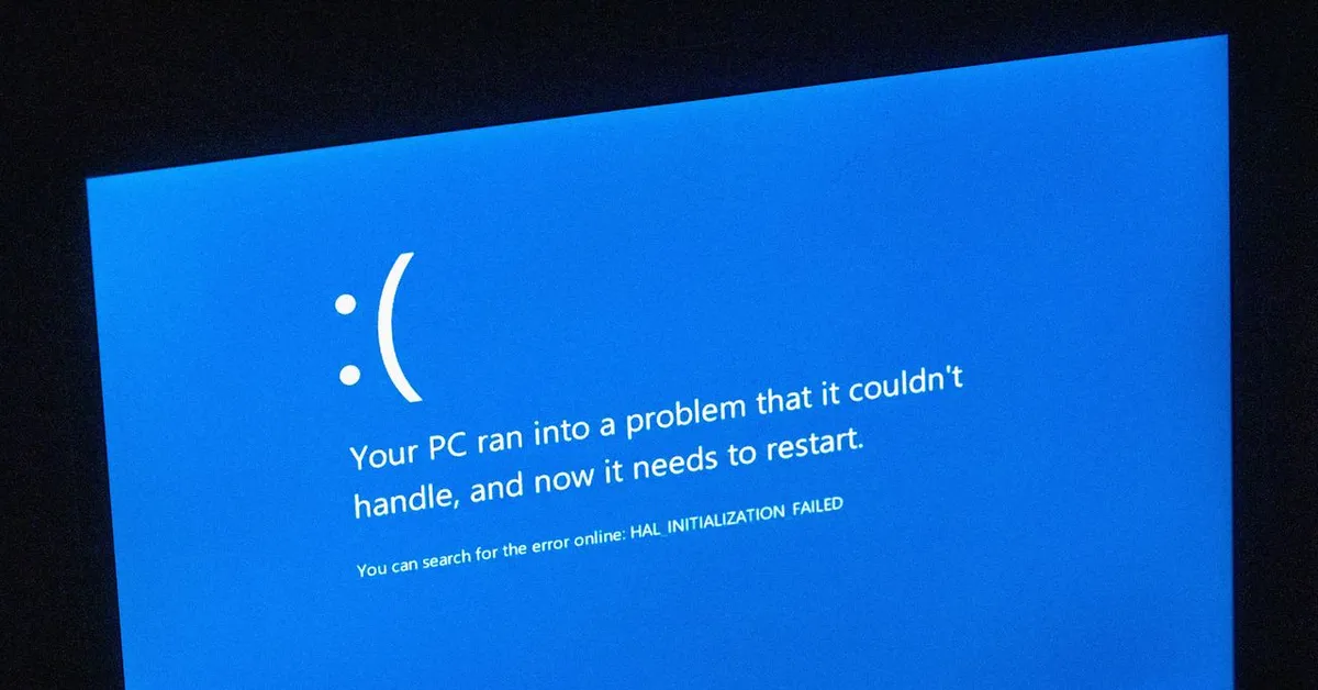
For nearly two decades, this arbitrary choice stuck, with only minor tweaks made to lessen its terror. Significant changes began with Windows 8 (2012), which attempted to create a more user-friendly crash screen, even incorporating a large, almost sarcastic sad-face emoji above the message: “Your PC ran into a problem that it couldn’t handle, and now it needs to restart.” With Windows 10 (2016), a QR code was introduced, allowing users to quickly access support pages via their phones instead of manually noting error messages.
In 2024, a problematic update from CrowdStrike rendered numerous PCs inoperable, affecting airlines, railways, banks, and more—all showcasing the Blue Screen of Death. This incident likely prompted Microsoft’s decision to distance itself from the negative connotations associated with the iconic blue screen. The company is officially promoting this redesign as part of the broader Windows Resiliency Initiative, aimed at enhancing the resilience of the operating system.
According to David Weston, Microsoft’s Vice President of Enterprise and OS Security, the redesign focuses on clarity and simplicity. It “improves readability and aligns better with Windows 11 design principles while preserving the technical information on the screen for when it is needed.” Furthermore, the removal of distinct visuals from the crash screen may reduce the potential for Apple to mock the BSOD in their marketing efforts.
However, before we celebrate this aesthetic shift, it’s worth considering whether Microsoft might regret this decision. Traditionally, blue is viewed positively across cultures—symbolizing calmness, serenity, and reliability. In contrast, black often conveys ominous feelings and can be perceived as cold or void-like. The Blue Screen of Death has become a recognizable symbol, easily identifiable and associated with significant system failures. A black crash screen, on the other hand, may blend in with update screens and create confusion among users.
As one commentator aptly pointed out, “You wouldn’t change the colors of road signs; why change the computer equivalent?” Regardless of the motivations behind this transition—be it to eliminate a negative image, unify design, simplify user experience, or simply for the sake of change—the Blue Screen of Death is on its way out. Nevertheless, the acronym BSOD is likely to endure, as the term “unexpected restart screen” lacks the punch and recognition of its predecessor. The BSOD may be dead, but its legacy will continue to live on in the hearts of users everywhere.